
100 years of


White
Gold
BEige
REd
"Five emblematic colours, five inspirations, five CHANEL codes. One signature."
Styling and branding
In order for this campaign to be successful, I need to make sure that I keep in with the brands aesthetic and branding, this includes using the colours, typefaces and formatting.
White - Illuminates the face, captures light, transparency
Black - nuns, servants, iconic little black dress, elegance
Beige - warm, natural, simple, skin, the outdoors
Gold - genuine and the full, religious relics, treasures
Red - life, blood, red lipstick, passion, fire
A beautifully edited video and part of a range of videos looking inside the brand of Chanel, this video explains the meaning and origins of each colour that is iconic and symbolic to the brand. Above I have made a 4 colour gradient of each colour to create a colour palette to use as a mood board for my research and design

The packaging
To keep in with branding I have designed the website to look like the iconic No5 packaging, that has minimalist detail, keeping to the colour scheme of black and white, white being the base colour with a distinct black box around the edge of the packaging. The black and white label complemented the functionality of the bottle and the perfume, in line with the simplicity and comfort of the hats and clothes Chanel had been creating since 1910
The font
All titles and important pieces of information will be using the Chanel logos font, Chanel does not have an official font but I have found a very similar font called Couture. All titles are also slightly spaced out to fit in with the styling as well.

The bottle
A transparent, crystal bottle, the amber liquid became the focal point of the product's design. The clean-cut vessel, with its rectangular shape and rounded shoulders, was a contrast to the ornate art deco-style bottles of the early 1900s. Although it is now in its 90th year of production, the current bottle barely differs from its original design. The company has always worked hard to retain the perfume's aspirational status. In 1934, the pocket flacon, a smaller-sized bottle, was created to reach middle-class customers.


History
Another beautifully edited video from the Chanel "Inside Chanel" campaign, this video shows the history of the perfume and all of its milestones.

1920s

Brand influencer: Coco Chanel
1930s

Brand influencer: Coco Chanel
1940s

1950s

Brand influencer: Suzy Parker
1960s
Brand influencer: Ali Macgraw

1970s

Brand influencer: Jean Shrimpton
1980s

Brand influencer: Cathrine Deneuve
1990s

Brand influencer: Carole Bouquet
2000s

Brand influencer: Nicole Kidman
2010s

Brand influencer: BRad P
LAyout
The layout of my Zine is an important part of the styling of the campaign and aesthetic. I have researched other fashion zines to take inspiration for how it could look. I already had a rough idea of what I wanted my zine to look like and some of the other zines I researched confirmed my ideas.
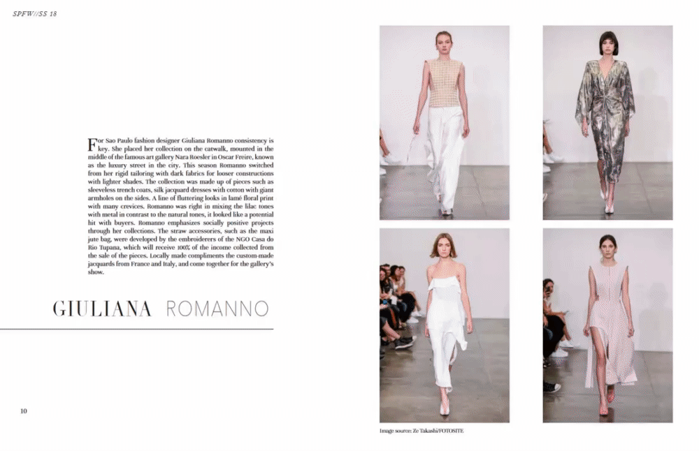
From a Brazilian fashion Zine looking at youth culture and lifestyle, modaBRASIL.
Minimal graphics, clean black and white lettering and graphics. Exactly what I want my zine to look like

Analysing modaBrasils layout

My mockup for the layout
using photoshop
QR codes
Playing around with InDesign, I found that you can generate QR codes. This gave me the bright idea to implement QR codes into my final print. this would mean that I link my website to my book, every single era will have its own dedicated QR code that you scan on to your phone. It will bring you to a page for the era, with a digital version, post edited photo and the inspiration. Along with thoughts and notes and the production vlog. This enables the book to look as minimal as possible while adding an interactive side and making the bridge between digital and print.
QR sizing

I want the QR code to be as small as possible, to keep to my styling. But there comes to a point where the QR is too small for scanners to pick up so there has to be a minimum size.

The smallest I can have my QR code is 25mmx25mm